2025 catalogue
tagima guitars
A complete redesign that reduced cost, increased impact, and put the brand's artists where they belonged — front and center.
the challenge
Tagima had been using the same catalogue design for three years. The same format. The same photographs of instruments. The same photographs of artists — or rather, the near-absence of them, since the brand's roster of musicians was consistently underrepresented in its own print materials.
The direction was simple: change everything.
The challenge wasn't just aesthetic. A growing product line meant more instruments to show, which in the standard A4 format would mean more pages, higher print costs, and a heavier, more expensive document. The brief demanded something dramatically different that somehow cost less.
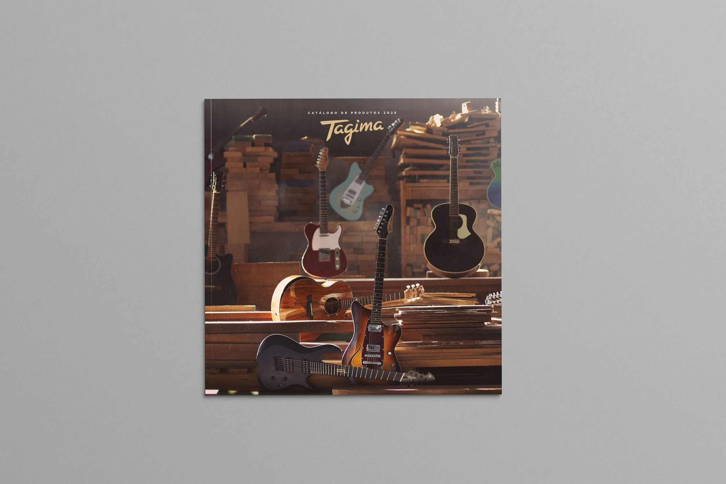
the approach
The solution came from rethinking the format before touching the design.
Replacing the standard A4 with a 27cm square — close to a vinyl record sleeve in its proportions — created an entirely different set of possibilities. The square format allowed for larger, more cinematic product photography while simultaneously reducing the total page count, even as the number of products increased. Fewer pages, more presence.
The result was a catalogue lighter and cheaper to produce than its predecessors — not as a compromise, but as a direct consequence of a smarter format decision.
The artist's strategy was rebuilt entirely. Rather than appearing only on their signature model pages, Tagima's roster of musicians was integrated throughout the catalogue, photographed with instruments across the full product range. The brand's people became part of the brand's story — which is where they should have been all along.
the result
A catalogue that costs less to produce, carries more products, and finally gives Tagima's artists the visibility the brand had been leaving on the table for years. The format change was the decision that made everything else possible.
Sometimes the best solution is a different shape.